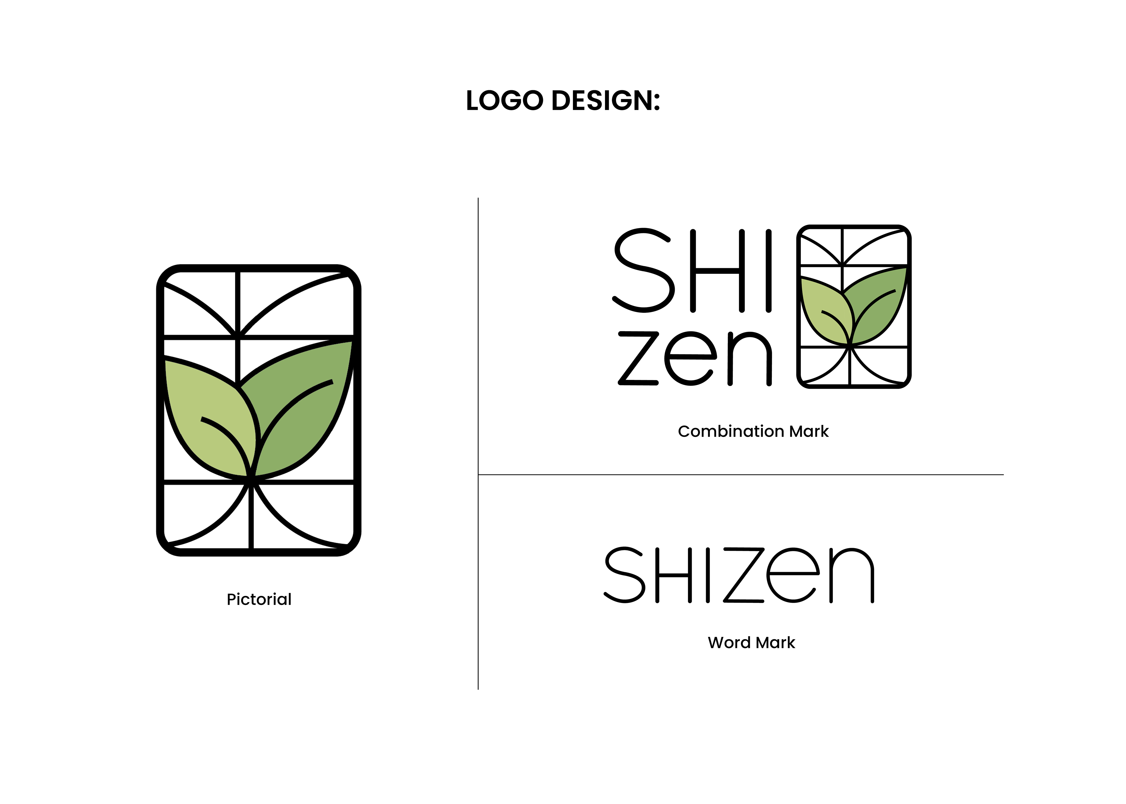
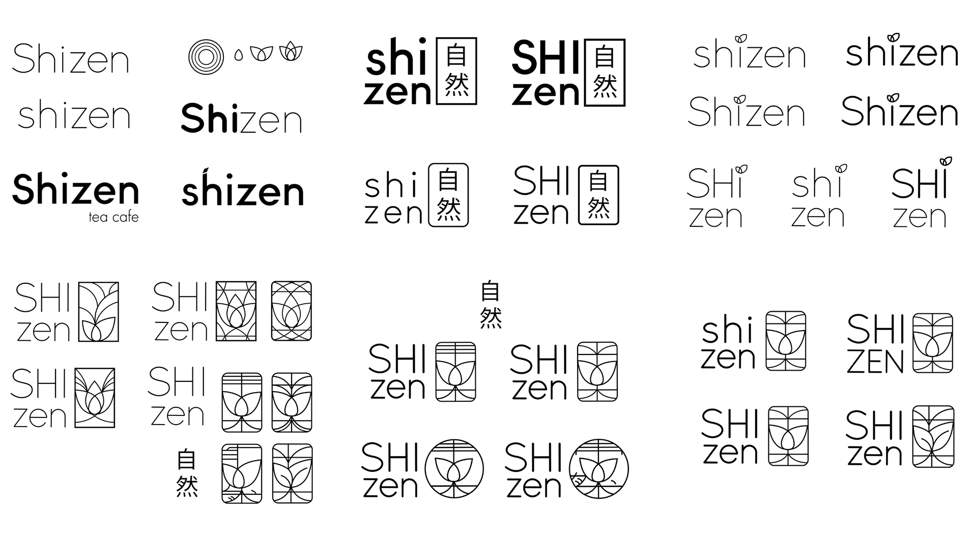
Shizen • shee-zen
The Japanese word shizen, pronounced "shee-zen", is a common noun that translates to mean "nature".
The Japanese word shizen, pronounced "shee-zen", is a common noun that translates to mean "nature".
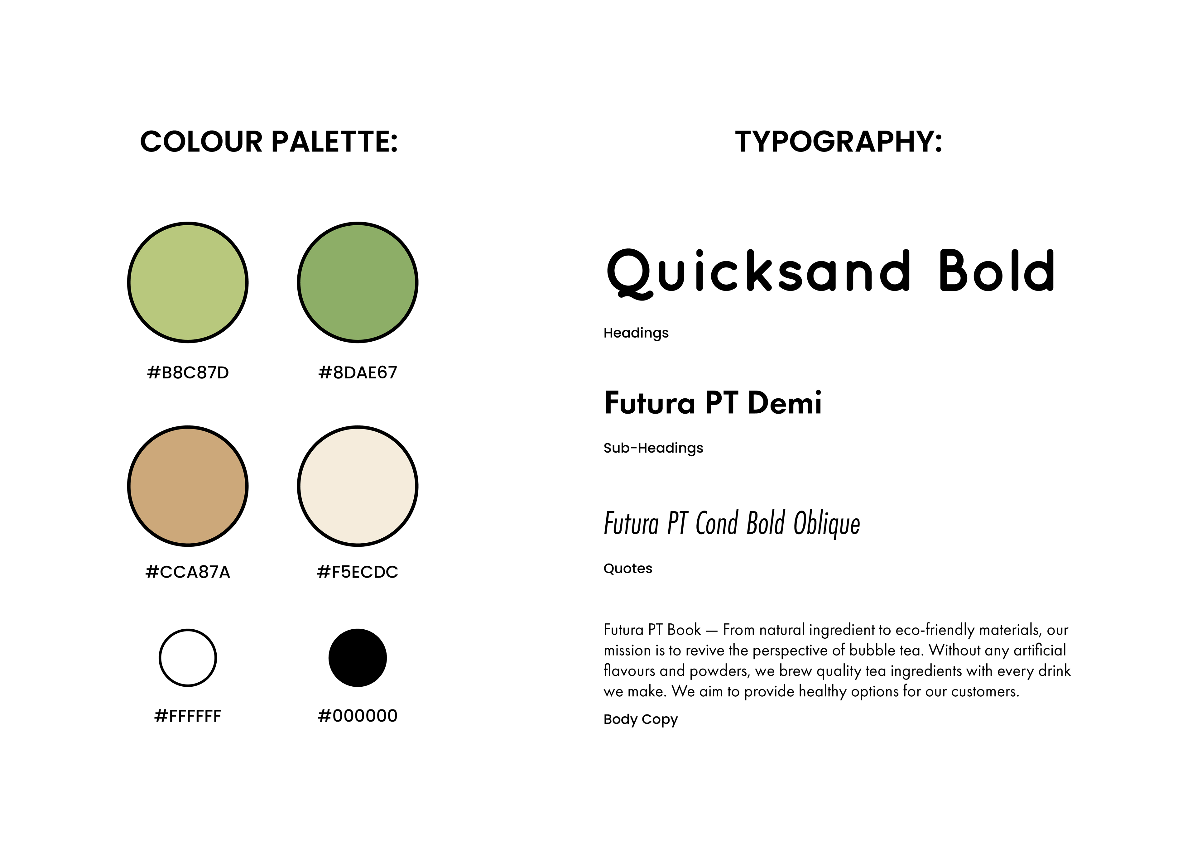
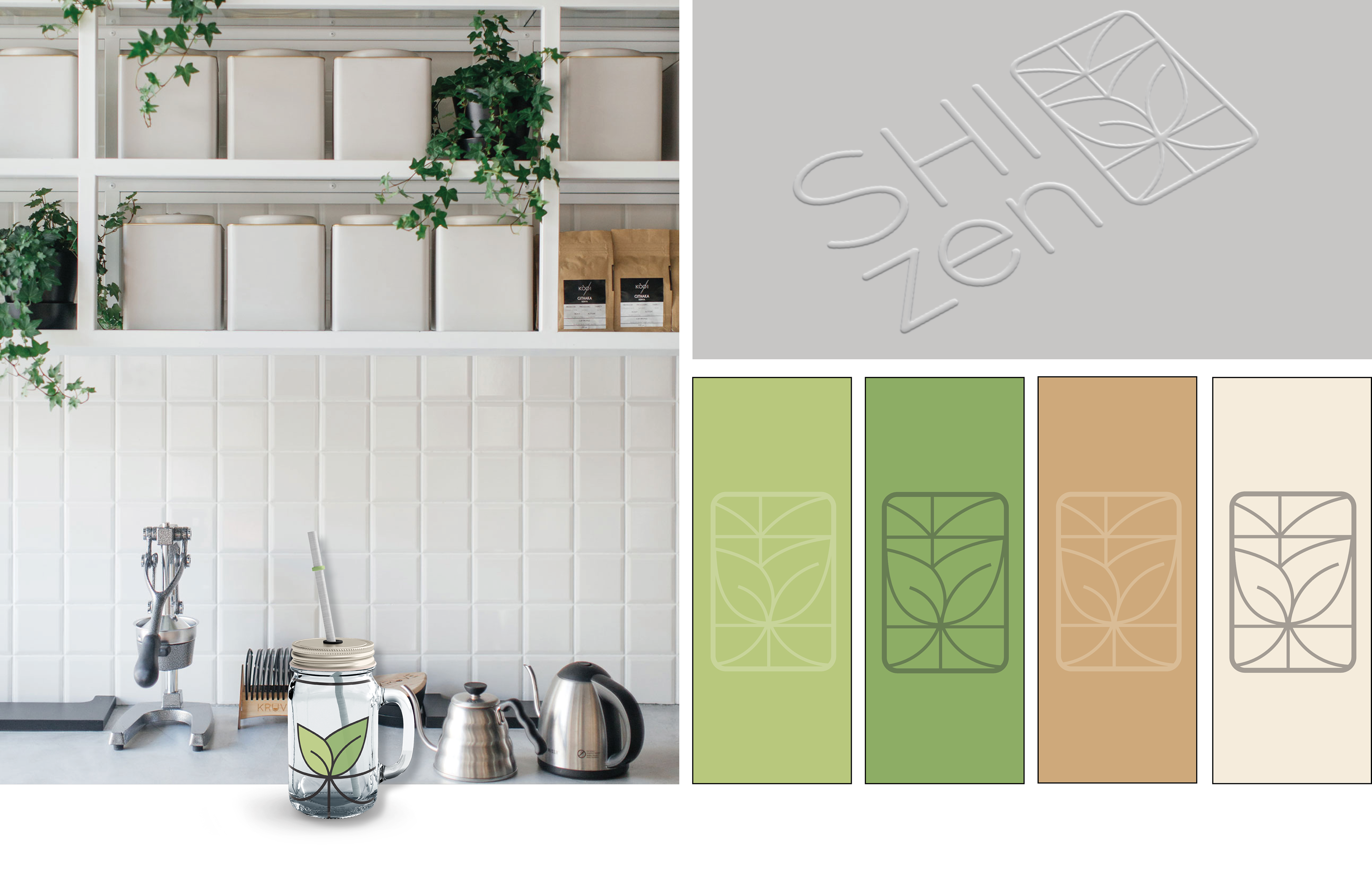
Shizen is a fictional bubble tea cafe that embodies nature in all forms. From natural ingredients to eco-friendly materials, their mission is to revive the perspective of bubble tea. They brew quality tea ingredients with every drink they make, no artificial flavours whatsoever. They promote reusable mason jars and stainless steel straws, reducing plastic one step at a time. Their mission is to provide healthy bubble teas and reduce the amount of plastic use in the overall market.
THE PURPOSE
The goal is to develop a brand from scratch, conduct market research, and apply effective branding.
TOOLS USED
Adobe Photoshop, Illustrator, InDesign

Shizen Outdoor Cafe Signage
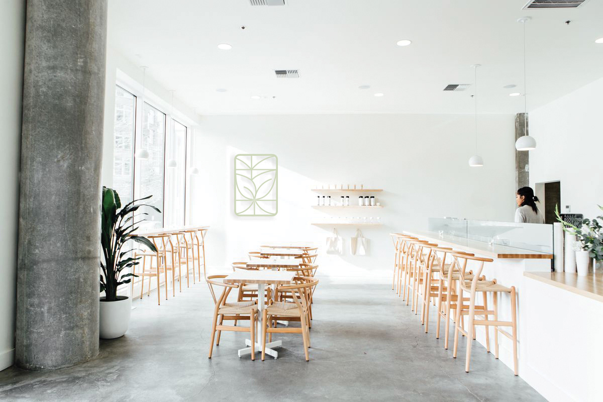
Shizen Cafe Interior

Shizen Wall Vinyl Menu

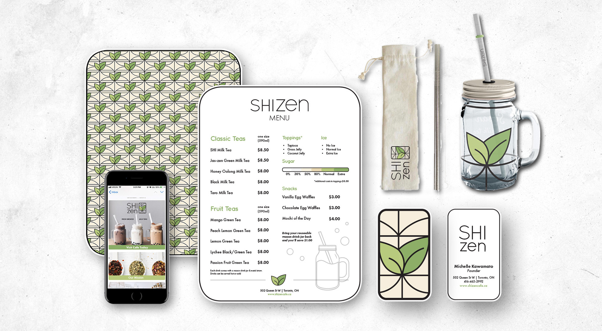

Shizen Apron

Shizen Mason Drink Jar Packaging
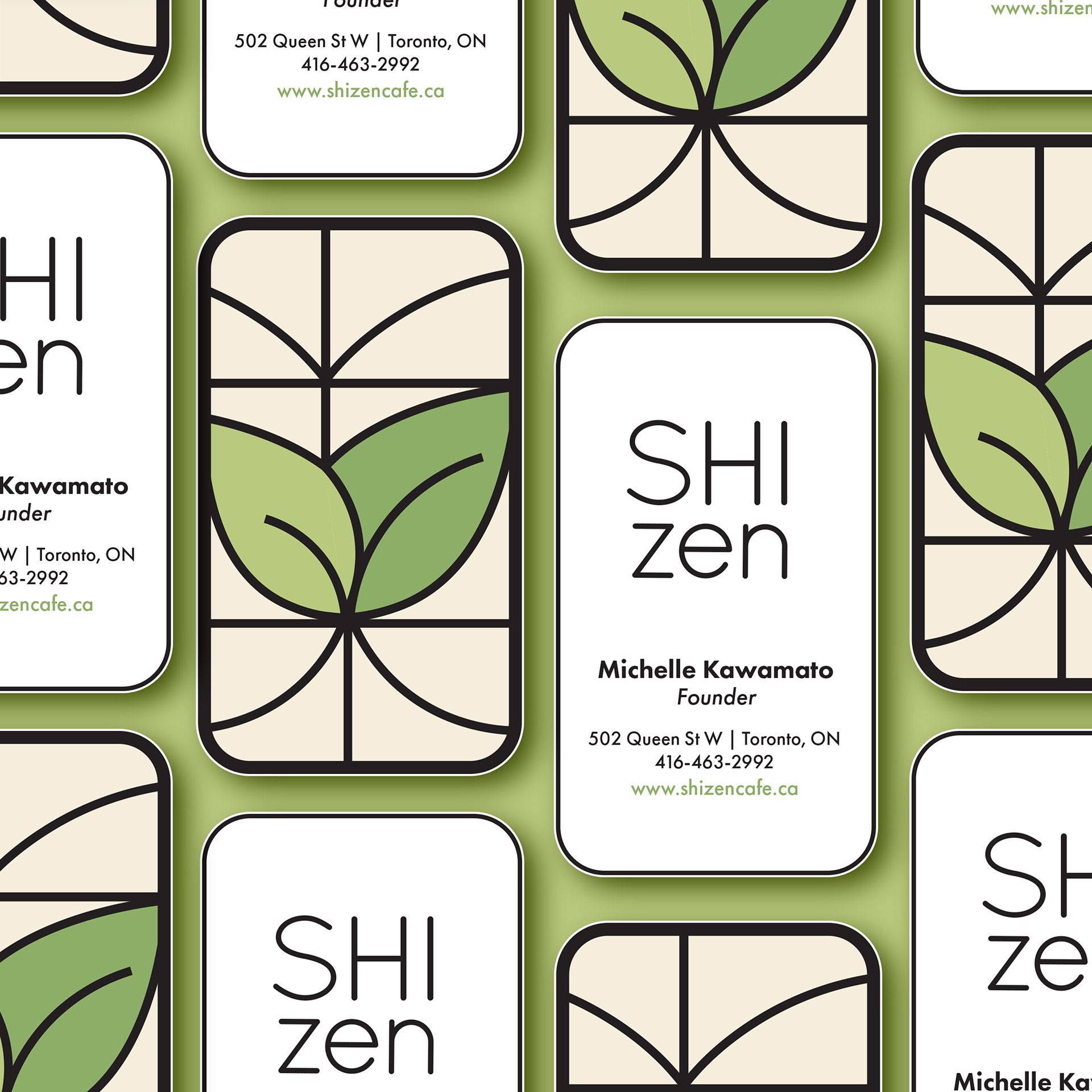
Shizen Business Cards

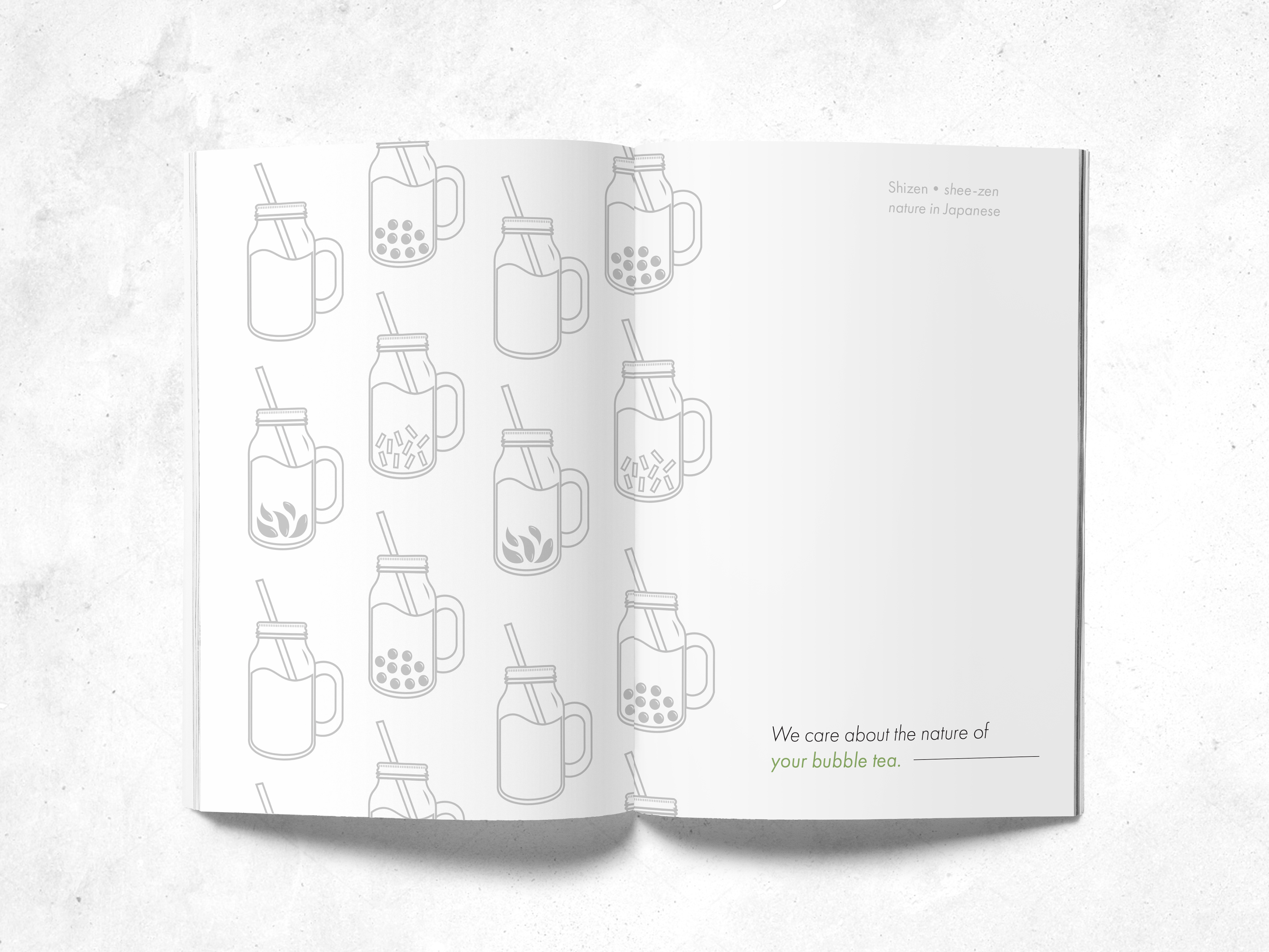
Shizen Look Book Guide - Inside Cover
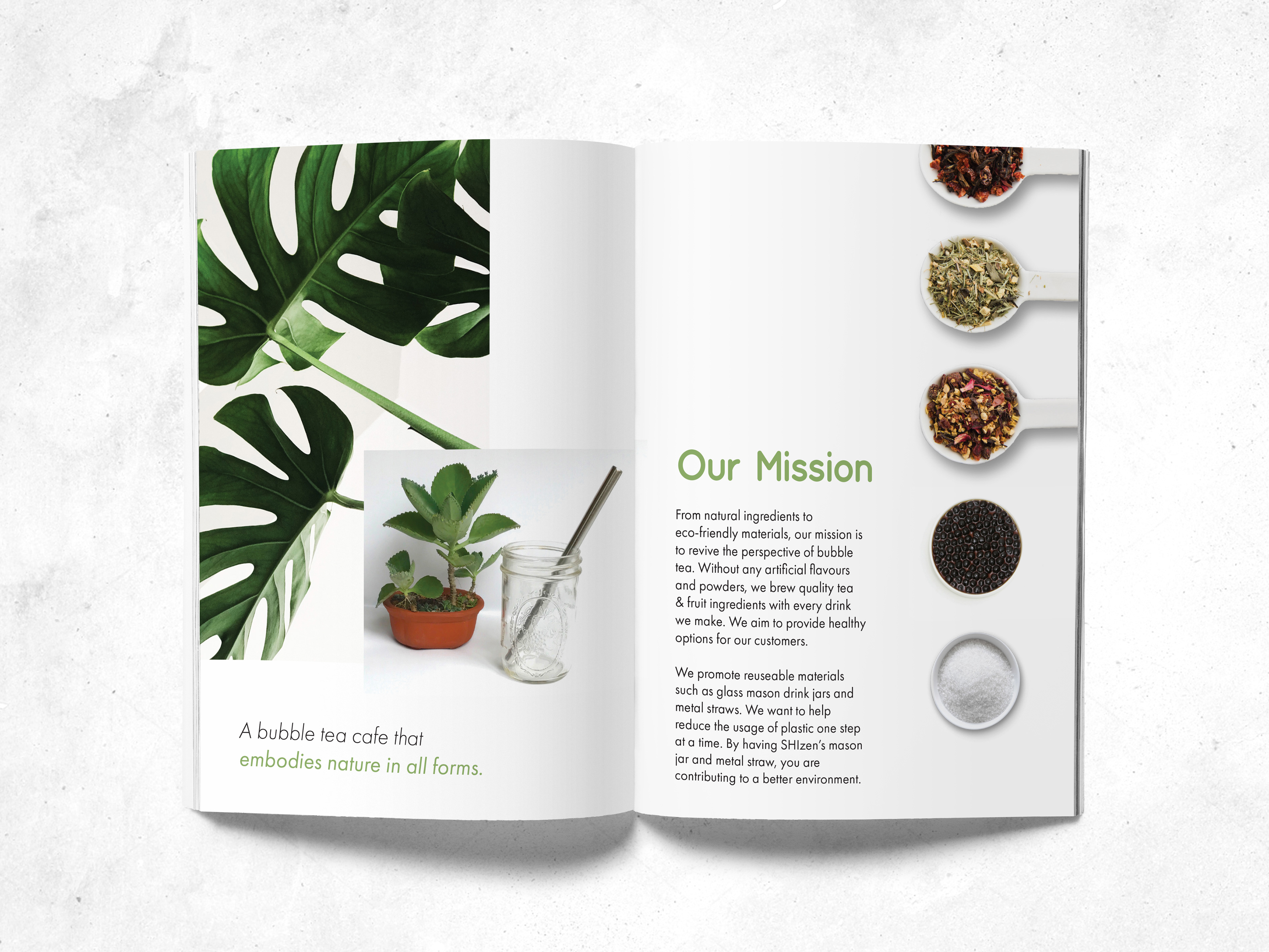
Shizen Look Book Guide - Our Mission Page
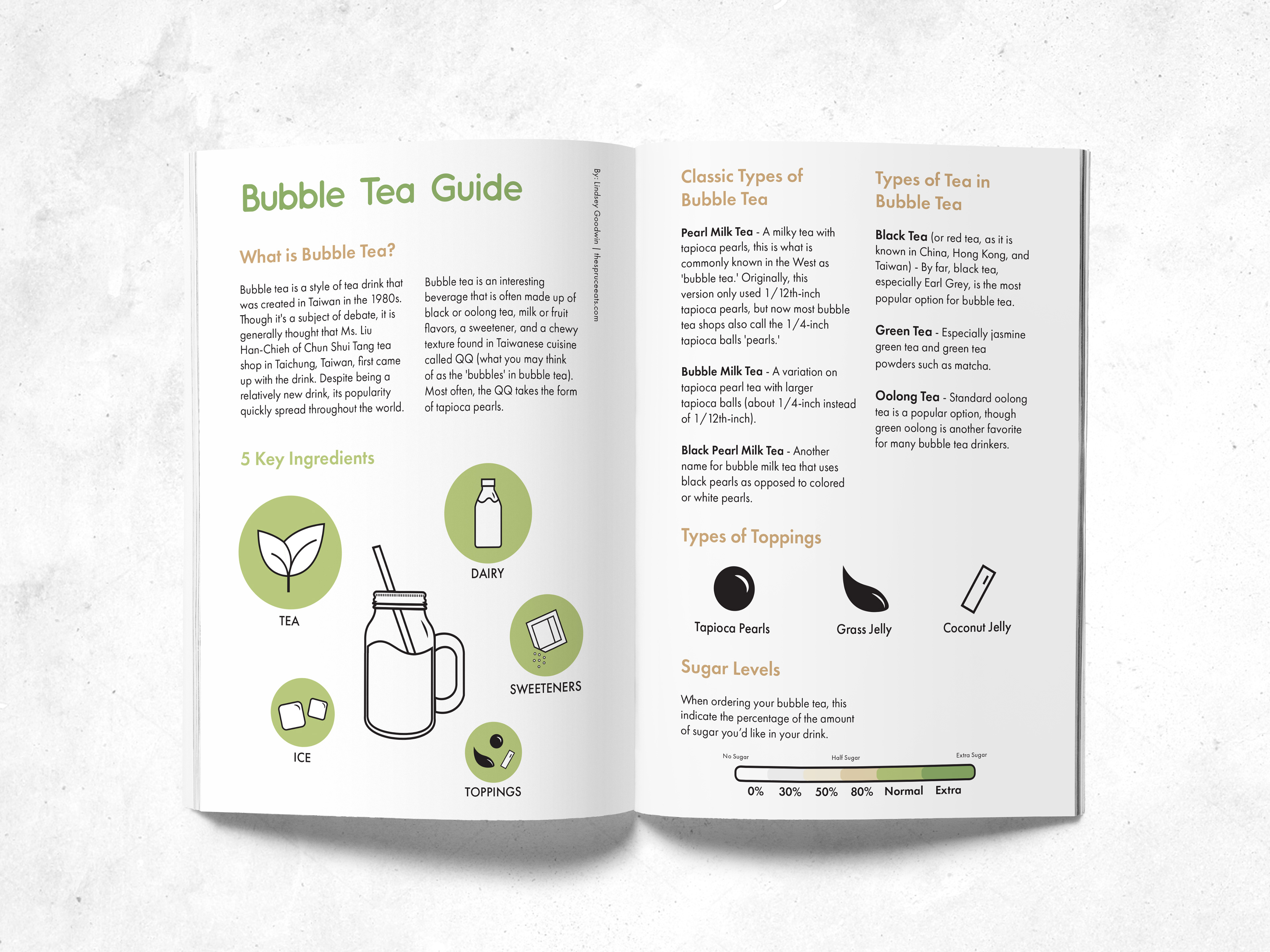
Shizen Look Book Guide - Bubble Tea Guide